Learn what mobile-first web design means and discover how it helps startups boost Google rankings, speed, and conversions.
Mobile-first web design is a development approach where you build the website for smartphones first and then scale it up for larger screens. It keeps your site fast, user-friendly, and favored by Google’s ranking algorithm from day one.
Most founders still picture their website on a laptop first. But over 62% of global web traffic now comes from mobile devices. If your site does not work well on a phone, you are losing more than half your potential audience before they read a single word.
Mobile-first design flips the traditional process. You start with the smallest screen and expand outward. The result is a cleaner, faster, and more focused experience for everyone.
Why Does Mobile-First Design Matter for Startups?
Startups work with limited time and budget. Every visitor who bounces due to slow loads or a broken mobile layout is a missed opportunity. Here is why mobile-first matters:
• Google uses mobile-first indexing, which means it evaluates the mobile version of your site for ranking decisions.
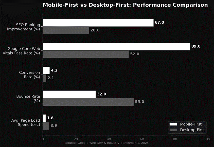
• Mobile users expect pages to load in under 3 seconds, and 53% will leave if it takes longer.
• A well-structured mobile experience directly improves your Core Web Vitals scores.
• Faster load times and clean layouts reduce bounce rates and increase time on page.
• Investors and potential customers often check your site on their phones first.
If you are building a startup website from scratch, a mobile-first approach through professional website design and development ensures you are not retrofitting later.
How Does Mobile-First Design Improve SEO Rankings?
Google officially switched to mobile-first indexing in 2023. The search engine now primarily evaluates your mobile site when deciding rankings. A poor mobile experience drags your position down regardless of how polished your desktop version looks.
Here is how mobile-first design directly supports your SEO and AEO growth strategy:
• Clean HTML structure improves crawlability for search engine bots.
• Faster page speeds contribute to higher Core Web Vitals scores, a confirmed ranking factor.
• Simplified navigation and content hierarchy help Google understand your pages.
• Responsive layouts reduce duplicate content issues that happen with separate mobile sites.
• Structured content naturally aligns with Featured Snippets and AI citation formats.
Search engines and AI platforms both reward content that loads quickly and reads clearly on any device. That makes mobile-first design one of the smartest foundational investments for any startup.
What Are the Key Elements of Mobile-First Web Design?
Building a mobile-first website is not just about making things smaller. It takes intentional decisions about layout, content, and performance:
• Responsive grid system that adapts smoothly across all screen sizes.
• Touch-friendly buttons and navigation with at least 48px tap targets.
• Compressed images and lazy loading to minimize page weight.
• Readable typography with a minimum 16px font size for body text.
• Simplified menus, often a hamburger menu, that do not overwhelm small screens.
• Content prioritization that puts your most important message above the fold.
• Minimal use of pop-ups and interstitials that frustrate mobile users.
Getting these fundamentals right can dramatically improve your conversion rate. For more detailed tips, check out our guide on 5 website tweaks that instantly increase your conversion rate.
The Bottom Line
Mobile-first web design is not a trend. It is the standard for how modern websites should be built, especially for startups that cannot afford to lose visitors to slow loads and clunky mobile experiences. Design for mobile first, and you get a faster, cleaner site that both search engines and AI platforms love.
Ready to build a startup website that performs from day one?
Visit viral-impact and let our team build a growth-ready digital presence for your brand.