Learn how to design a scalable logo that stays clear and recognizable across every size and digital format.
You design a scalable logo by keeping shapes simple, using clean lines, and testing it from a billboard down to a favicon. A logo that avoids fine details and uses strong geometry remains recognizable whether it appears on a business card or a website header.
Most startups rush through logo design. They pick something that looks great on a laptop screen and call it done. Then it falls apart on a mobile app icon or a printed invoice. The problem isn't talent. It's a process. A logo built for one size will always fail at another.
Why Does a Logo Need to Work at Every Size?
Your logo appears in more places than you realize. It lives on your website, email signatures, packaging, pitch decks, and social profiles. Each context demands a different size. Losing clarity at small sizes means losing brand recognition.
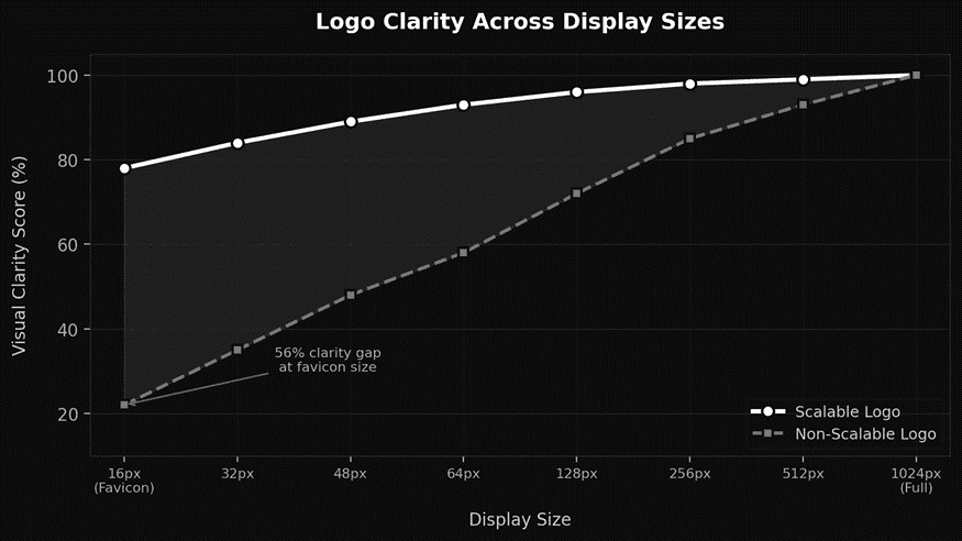
• Favicons display at just 16x16 pixels. Complex logos become unreadable blobs at that scale.
• Social media avatars crop and compress your mark. Clean geometry survives this better than detailed illustrations.
• A strong brand identity starts with a logo that performs at every dimension without losing its core shape.
What Makes a Logo Scalable?
Scalability comes down to structure. The best logos share a few traits that make them flexible across every medium.
• Simple geometry. Circles, squares, and triangles read clearly at 16 pixels and 16 feet.
• Minimal detail. If something disappears at small sizes, it shouldn't be in the design.
• Vector format. Always design in SVG or vector tools. Vectors scale infinitely without pixelation.
• Strong contrast. High contrast between your mark and its background keeps it visible everywhere.
• Responsive variants. Create a primary logo, a simplified icon, and a wordmark for different contexts.
How Do You Test a Logo Across Sizes?
Testing is where most founders skip. Run your logo through these checks before finalizing anything.
• Print it at business card size and check if every element stays visible.
• Set it as a browser favicon. If the shape holds at 16 pixels, your geometry is solid.
• View it in a social media profile circle on mobile. Cropping reveals weaknesses fast.
• Preview it on your actual website layout. The header, footer, and mobile version each need to look intentional.
• Test in grayscale. A logo that depends on color won't survive dark mode or single-color printing.
Logo Scalability Checklist by Use Case
Use Case | Size Range | Recommended Variant | Key Requirement |
Favicon | 16 - 32px | Icon mark only | Extreme simplicity |
Social avatar | 48 - 128px | Icon or simplified logo | Circular crop safe |
Email signature | 100 - 200px | Full logo (horizontal) | Clear at low resolution |
Website header | 150 - 400px | Full logo with wordmark | Responsive sizing |
Print/billboard | 1000px+ | Full logo (vector) | Vector format essential |
What Common Mistakes Break Logo Scalability?
Watch out for thin strokes that vanish on screens, gradients that flatten at small sizes, and text-heavy logos that become illegible below 100 pixels. Another frequent mistake is designing only one version. Startups that invest in a strong brand identity build multiple logo variants from day one.
The Bottom Line
A logo that only works at one size is a liability, not an asset. Prioritize simplicity, test across real-world contexts, and create responsive variants. That consistency is what turns a startup into a brand people actually remember.
Need help building a brand identity that performs at every scale? Visit Viral-Impact to explore how we help startups create logos and visual systems designed for growth.