Design video thumbnails that earn more clicks by using proven visual tactics that top content creators rely on.
A great video thumbnail combines a bold visual with a clear message that stops the scroll. Get the contrast, the face, and the text right, and your click-through rate will climb.
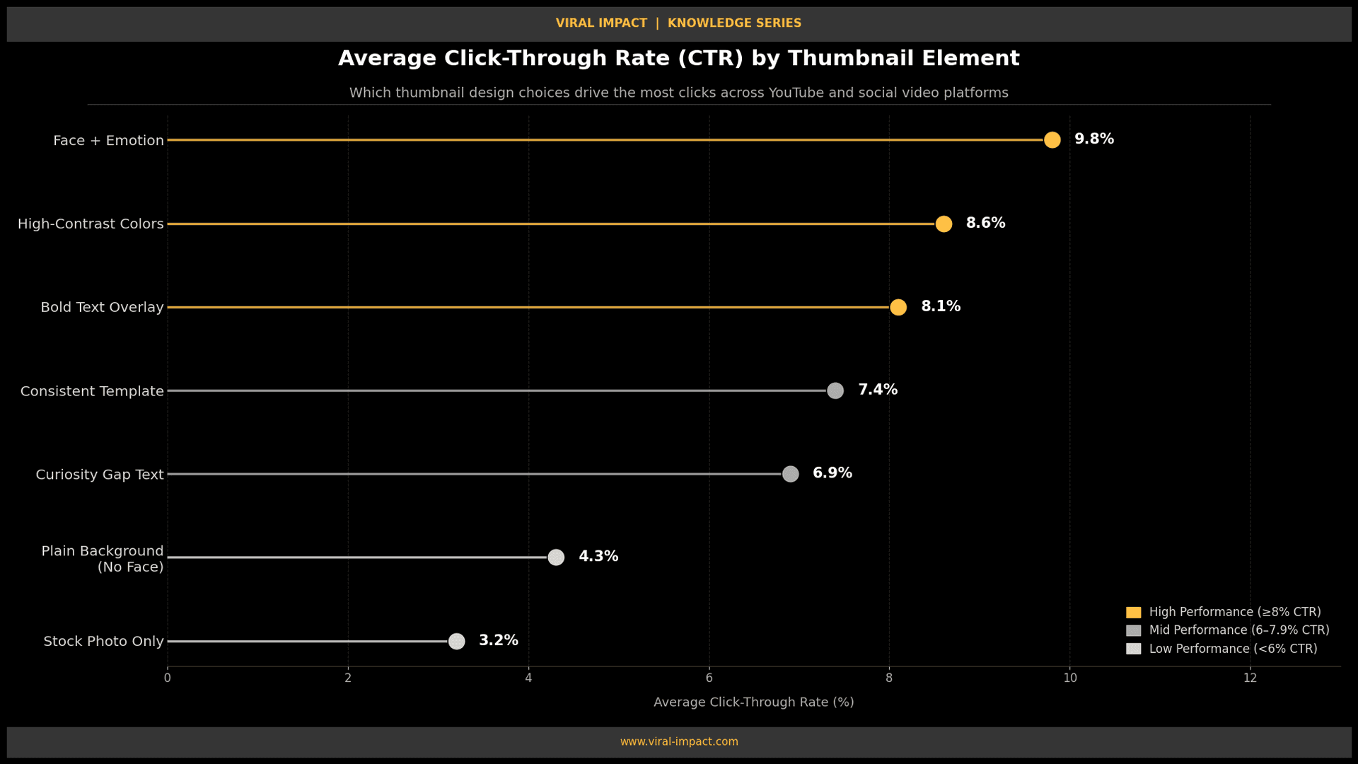
Why Thumbnails Decide Whether Your Video Gets Watched
Your thumbnail is the first thing people see. Not the title, not the description, the thumbnail. On YouTube, the average click-through rate sits between 2% and 10% across channels. The ones that push past 8%? They almost always have thumbnails built with intention.
A weak thumbnail doesn't just lose a click. It signals to the algorithm that your content isn't worth surfacing. Getting this right is not optional; it's part of your content strategy from day one.
Nail the Composition Before Anything Else
The layout of your thumbnail matters more than most creators realise.
• Use a simple, uncluttered background, one subject, one clear message.
• Apply the rule of thirds: place your main subject slightly off-centre rather than dead centre.
• Keep the focal point in the upper two-thirds of the frame so UI overlays don't cut it off.
• Leave breathing room around text. Cramped thumbnails communicate low effort.
A clean layout lets the eye land naturally on what matters. That split-second clarity earns the click.
Use Faces and Make the Expression Count
YouTube's own data confirms that thumbnails with human faces outperform those without. But the expression has to be real and readable.
• Use close-up shots where the emotion is obvious surprise, intensity, curiosity, or disbelief.
• Eyes need to be clearly visible. Shadows, glasses, or poor lighting kill the connection.
• Never use stock photo faces. They feel fake, and viewers recognise it instantly.
If you are building a content brand alongside your videos, how your visuals communicate trust matters across every channel. Our social media content design service helps brands create consistent, attention-grabbing visuals built for scroll-stopping impact.
Choose Colours That Pop on Every Screen
The platform your content lives on, YouTube, LinkedIn, or X, has its own default background. Your thumbnail needs to stand out on all of them.
• Use high-contrast colour pairings: yellow on black, white on deep red, or black on bright orange.
• Avoid muted or pastel palettes unless your brand specifically calls for them.
• Test your thumbnail at a small size, around 60 by 45 pixels. If it still reads clearly, you are ready.
If the image looks muddy at thumbnail size, it will lose clicks before most viewers ever engage.
Write Text That Earns the Click
Not every thumbnail needs text overlay. But when you use it, it needs to do real work.
• Stick to three to five words max. The thumbnail is not the title; they should work together.
• Use thick, bold fonts with a drop shadow or solid outline, so text reads on any background.
• Write a promise or tension point: "I got this wrong," "Never do this," "The real answer."
• Skip full sentences. Fragments and curiosity phrases outperform explanations every time.
Text on a thumbnail should make someone feel they will miss something if they skip the video.
Build a Consistent Visual Template
Random thumbnail styles hurt you. Consistency is what builds recognisability.
• Lock in a thumbnail template with the same font, colour accent, and subject placement every time.
• Apply a consistent photo filter or colour grade across all imagery.
• A small logo or channel badge in one corner is fine, just don't let it compete with the main subject.
When your brand shows up consistently in feeds, viewers pause even before reading the title. That kind of visual recognition is built intentionally, not by accident. It is the same thinking explored in our post on the science of visual trust and how it drives brand performance.
Track CTR and Treat Your Thumbnails as Testable Assets
Designing a thumbnail without checking the data is just guessing. Most platforms give you the numbers.
• Review click-through rate weekly, not just at upload.
• If a video has high impressions but low CTR, swap the thumbnail before changing anything else.
• High impressions plus low CTR almost always point to a thumbnail problem, not a content issue.
Once you are generating clicks, the content behind the thumbnail needs to deliver. That is where SEO blog writing comes in; strong written content turns thumbnail clicks into real audience growth.
The Bottom Line
A thumbnail is a decision made in under half a second. Keep the composition clean, the expression readable, the text tight, and the colours bold. Track what works and iterate from the data.
If you want to build a content and visual strategy that drives real growth, Viral Impact works with startups and SaaS brands to create systems that move the needle. Visit the homepage to get started.