Avoid the biggest landing page mistakes that kill startup conversions and learn proven quick fixes to grow faster.
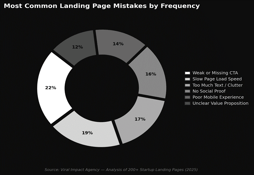
The biggest landing page mistakes include unclear value propositions, weak calls to action, slow load times, and cluttered layouts that confuse visitors. Fixing these issues can double your conversion rate and prevent you from wasting money on traffic that never converts.
You spend weeks building your product and driving traffic to your site. But visitors land on your page and leave within seconds. For most startups, the landing page is where growth takes off or falls flat. The mistakes that kill your conversions are usually simple ones that nobody points out until the damage is done.
Why Does an Unclear Value Proposition Hurt Conversions?
Your headline has about five seconds to answer one question: why should I care? If visitors cannot immediately understand what you offer, they bounce.
• Lead with the specific outcome your product delivers, not jargon or feature lists.
• Write your headline for someone who has never heard of your brand.
• Keep the subheadline to one sentence that reinforces the promise with a measurable benefit.
How Does a Weak CTA Kill Your Landing Page?
A vague or hidden call-to-action is like opening a store without a door. Your CTA needs to be impossible to miss and clear about what happens when someone clicks.
• Replace generic labels like "Submit" with action-driven text like "Get My Free Audit."
• Place your primary CTA above the fold and repeat it further down the page.
• Stick to one primary action per page. Multiple competing CTAs split attention and hurt conversions.
Do Slow Load Times and Cluttered Layouts Really Matter?
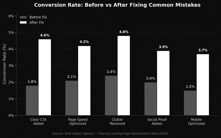
A page loading in five seconds instead of one sees a 90% jump in bounce rate. Combine slow speed with a cluttered layout, and you lose visitors before they read your offer. Every element on your landing page must serve the conversion goal, or it should go.
• Compress images and use modern formats like WebP to cut load times.
• Remove unnecessary scripts and heavy animations that slow rendering.
• Use white space generously and limit navigation. Removing the top menu alone can boost conversions by up to 100%.
Why Do Missing Trust Signals and Poor Mobile Design Tank Results?
People trust other people more than marketing copy. Pages without testimonials feel risky to new visitors. Over 60% of traffic comes from mobile, so a desktop-only page leaves money on the table. For a complete breakdown, read our guide on how to design a high-converting landing page.
• Add real testimonials with names and specific results instead of generic praise.
• Display trust badges or media mentions near your CTA to reduce friction.
• Test on multiple devices before launch. Investing in professional website design ensures nothing breaks across screens.
The Bottom Line
Most landing page mistakes are blind spots that founders overlook because they are too close to their product. An unclear message, a buried CTA, a slow page, or a cluttered layout can quietly destroy months of marketing effort. The good news? These fixes are straightforward, and the impact on conversions can be immediate.
Ready to build a landing page that actually converts? Visit Viral-Impact and let our team turn your visitors into customers.