Discover the best fonts for professional branding and learn how typography shapes trust, recognition, and credibility.
The best fonts for professional branding are clean, readable typefaces that match your brand's personality. Serif fonts signal trust and tradition, while sans-serifs feel modern and approachable; the right choice depends on who you're talking to.
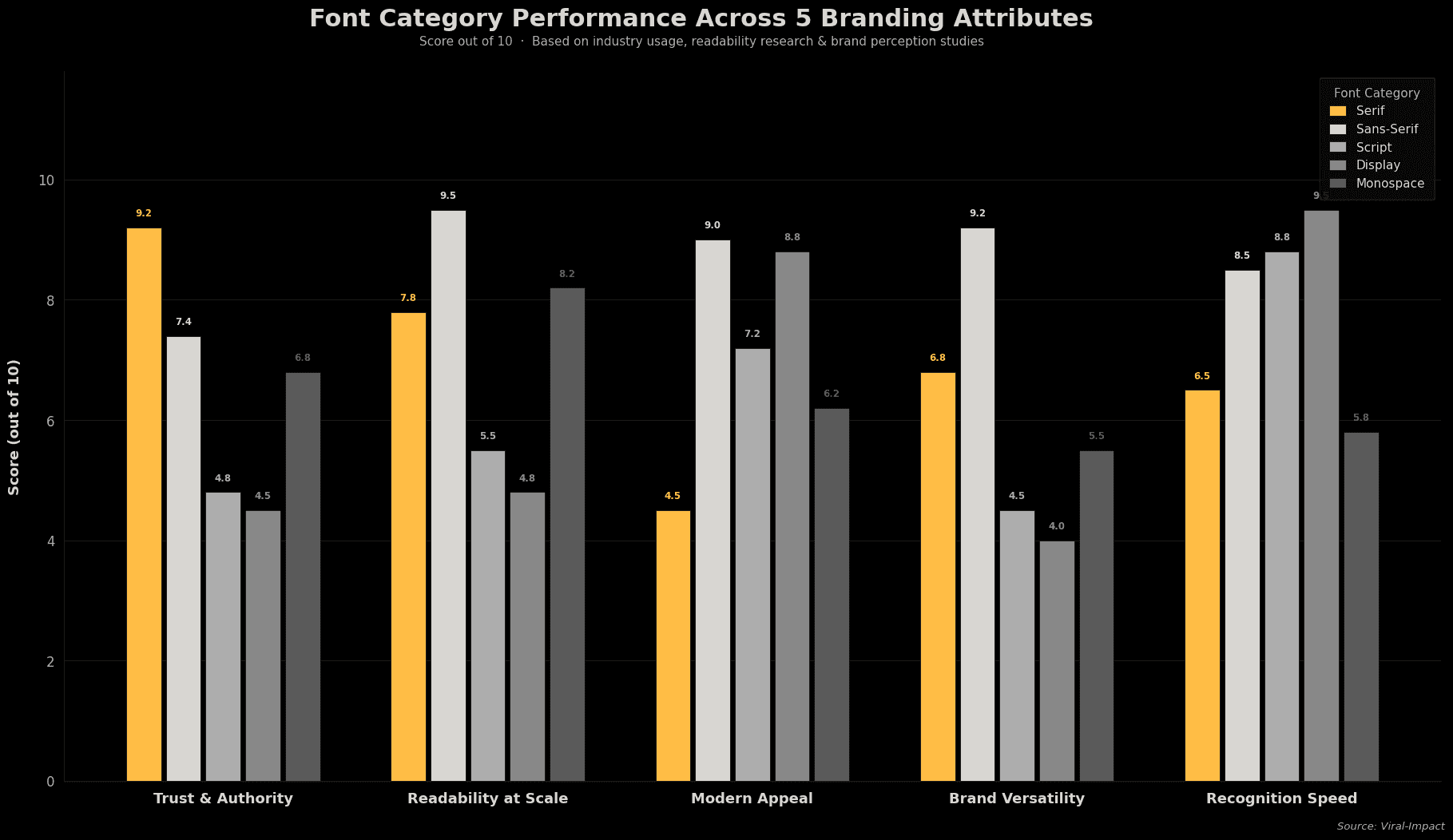
Typography shapes perception before a word is read. The font alone signals whether a brand is modern or established, premium or casual.
Why Does Font Choice Matter in Branding?
Fonts carry meaning. Research from MIT found that visual impressions form within milliseconds. The typeface you pick is part of that snap judgment.
Here's what different font categories signal:
• Serif (Garamond, Georgia, Playfair): trustworthy, established, editorial.
• Sans-Serif (Inter, Helvetica, Montserrat): clean, modern, tech-forward.
• Script (Pacifico, Brittany): personal, artisanal, creative.
• Display (Bebas Neue, Canela): distinctive, bold, expressive.
• Monospace (JetBrains Mono): precise, technical, developer-focused.
What Are the Top Fonts for Each Industry?
Tech and SaaS brands:
• Inter: highly readable, trusted across products and marketing.
• DM Sans: approachable and clean.
• Neue Haas Grotesk: refined, premium feel.
Finance, law, and consulting:
• Playfair Display: authoritative, strong editorial presence.
• Libre Baskerville: open-source serif, solid and reliable.
• Freight Text: clear with character, great for long-form.
Creative and consumer brands:
• GT Walsheim: warm but professional.
• Circular: human and friendly.
• Canela: editorial, high-end feel for lifestyle brands.
Font Categories by Use Case
Different font types suit different brand contexts. Use this table as a quick reference when evaluating type choices for your brand:
Font Category | Best For | Trust Level | Modern Feel | Example Fonts |
Serif | Finance, Law, Publishing | High | Low–Medium | Garamond, Playfair Display |
Sans-Serif | Tech, SaaS, Startups | Medium | High | Inter, Helvetica, Montserrat |
Script | Lifestyle, Beauty, Food | Medium | Medium | Pacifico, Brittany |
Display | Fashion, Entertainment | Low | High | Canela, Bebas Neue |
Monospace | Dev Tools, Tech Products | Medium | Medium | JetBrains Mono, Courier |
How to Build a Font Pairing That Works
Most brands use two typefaces: one for headlines, one for body text. The goal is contrast without conflict.
Rules that work:
• Pair a serif headline with a sans-serif body (e.g., Playfair + Inter).
• Avoid two fonts from the same category that look too similar.
• Use no more than three typefaces across all brand materials.
• Test both fonts at small sizes on mobile; readability wins every time.
Your logo typeface can be more expressive and distinctive. Body text should prioritize readability over personality. A solid brand identity system ties both together with clear rules on sizing, weight, and spacing.
How Fonts Affect Your Website and Conversions
Font choice isn't purely aesthetic. It directly affects readability, page load speed, and whether visitors stay long enough to convert.
• Keep body text at 16px minimum for comfortable reading.
• Aim for a line height of 1.5–1.7 to improve flow.
• Limit font weights to 2–3 per typeface to keep load times fast.
• Test on mobile before finalizing; desktop isn't the full picture.
Your website design should treat fonts as a functional decision. The wrong typeface at 14px on mobile can cost you visitors before they see your offer.
Brand perception research, covered in this guide on visual trust and brand identity, confirms that consistent typography is one of the most underrated trust signals for early-stage brands.
The Bottom Line
Font choice is a brand decision, not a design detail. The right typeface makes a brand feel intentional. The wrong one looks assembled in a hurry, and people notice.
If you're building a brand that needs to earn trust and look credible from day one, the team at Viral-Impact can help you get it right, from typography to full visual identity.