Learn what visual hierarchy in design means and how startups can use it to boost conversions and engagement.
Visual hierarchy is the arrangement of design elements in order of importance so users notice the most critical information first. It controls how people scan, read, and interact with any page, whether that’s a website, landing page, or app.
Every time someone lands on your site, they make a split-second decision. Stay or leave. That choice often depends on whether they can figure out what matters most within the first few seconds. That’s exactly where visual hierarchy steps in.
It’s not just a design buzzword. It’s the invisible structure behind every page that actually converts. Without it, visitors feel lost. With it, they flow naturally from headline to CTA.
Why Does Visual Hierarchy Matter for Startups?
Startups rarely get second chances with first impressions. A strong visual hierarchy helps you:
• Guide visitors toward your call-to-action faster.
• Reduce bounce rates by making content scannable.
• Build trust through organized, professional layouts.
• Improve conversions without increasing ad spend.
If your landing page copywriting doesn’t follow these principles, even great copy falls flat.
What Are the Key Principles of Visual Hierarchy?
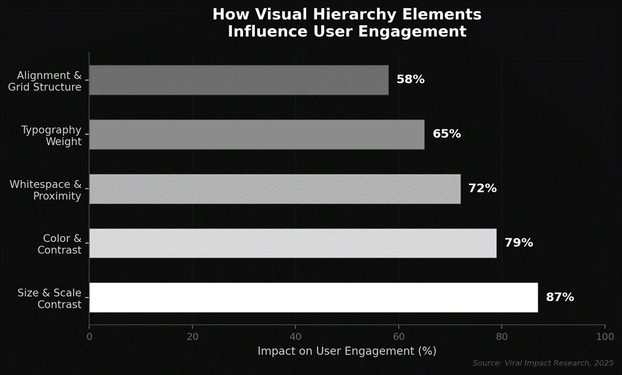
Five core principles work together to control where users look and what they do next.
• Size and Scale: Larger elements grab attention first. Your headline should be the biggest text on the page.
• Color and Contrast: High-contrast colors draw the eye. Use them on buttons and key messages.
• Typography and Weight: Clear differences between headings and body text create a natural reading path.
• Whitespace and Proximity: Spacing tells users what belongs together. Crowded layouts confuse people.
• Alignment and Grid Structure: Consistent alignment creates order and feels professional to navigate.
Research shows that size and scale alone account for up to 87% of what users notice first on a screen.
How Do You Apply Visual Hierarchy to a Website?
Think of it as stacking priorities from highest to lowest.
• Start with your headline; make it large, bold, and at the top.
• Use a contrasting CTA button that stands out from the background.
• Break content into short sections with clear subheadings.
• Add whitespace so nothing feels cramped.
• Keep navigation simple and predictable.
Strong website design and development always begins with this foundation. Without a clear visual path, even beautiful sites won’t convert.
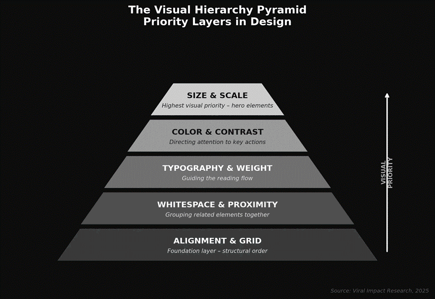
The pyramid above shows how design elements stack by priority. Size and scale sit at the top because they carry the most visual weight. Everything below reinforces structure and flow.
What Happens When You Ignore Visual Hierarchy?
Skip visual hierarchy, and visitors will notice, even if they can’t explain why.
• Users can’t find the CTA and leave without converting.
• Important information gets buried below visual noise.
• Bounce rates climb because pages feel overwhelming.
• Brand credibility drops from messy, disorganized layouts.
Nielsen Norman Group research shows users leave a webpage within 10 to 20 seconds if they can’t identify a clear value proposition. Visual hierarchy is what surfaces that value fast.
Want to see these principles applied? Check out this guide on how to design a high-converting landing page to see how layout decisions impact real conversion numbers.
The Bottom Line
Visual hierarchy isn’t a design luxury; it’s a growth tool. For startups competing in crowded markets, the way you organize a page determines whether visitors convert or bounce. Every element, from headline size to button color, either guides people toward action or pushes them away.
Ready to build a site that turns traffic into leads?
Visit Viral-Impact and let our team create a design strategy that converts from the first click.